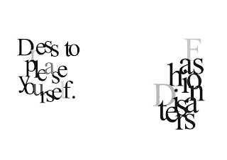
My front cover is very plain but I think it works well because there are no images and the page has a lot of space on it. I really like the positioning of the type, I also like the way the type starts to look like a pattern. I have chosen Baskerville for my type as I think it looks that little more professional and has that little more detail to it.
The page that works the best is Victor and Rolf spread,
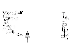
The reason I like this one the best is because there is not much information on the page so it doesn’t look overcrowded, I like the positioning of the letters on the first page as they look like they are flowing down to the images. The image is very small but powerful because of the space around it. I also like the distance between the two sets of type because I think it has a great feel about the spacing. I think the other pages had a little too much information on them and that made the pages look too busy and some of the images were to big taking up to much space for example the uma Thurman spread.
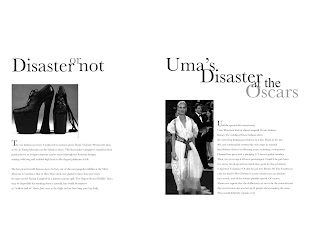
Also on this page the heading is too plain as the letters are not really mixing up and this doesn’t represent the word glitch. I am not really sure weather my magazine worked but I really liked my idea. I think if the rest of my pages looked like the front cover and the Victor and Rolf spread the booklet would of worked really well. I think the other pages looked to busy. For my type I got my inspiration from David Carson’s ray gun, were his type is different in sizes and turned up side down and he makes it look like an image.
I have also made changes to my magazine, which I think is much better as I have tried to make the whole of this booklet look like the Victor and Rolf page spread. The pages in the third booklet looks much better as there is less information so the pages don’t look to busy and all the type is made to look interesting and different. The spread which I think has improved the most is the John Galliano for Dior in my first magazine design there was too many images on one spread so that didn’t leave much space for the heading or the information.
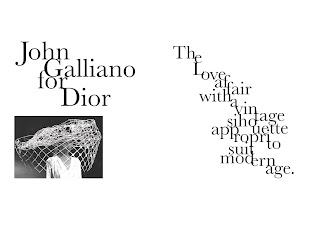
So for my changes magazine I decided to use one image and only use a small amount of information so the pages look much better as there’s a lot of space on the page and you feel you can focus on it more as it isn’t to busy.
I think the best pages in this book are the Victor and Rolf page and also the London fashion week spread because of again the space on the page.
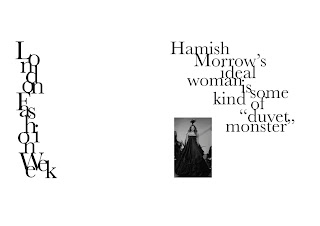
I like the distance between the heading, the image and the information, I also think the positioning of the heading down the page makes it look like a pattern I think this magazine works best because it is interesting to look at because of the positioning of the letters and each page has a different layout it also still gives you information but not to much writing because I think that it can get to boring.
No comments:
Post a Comment