Saturday, 15 December 2007
Research on different websites.
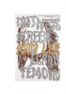
I think the last design will link in with MMparis designs as they make there type become interesting but making them look like an image or makeing the type from an image. MM Paris is a daily collective on arts, design, graphics, fsashion or photography. the designer names are Michael Amzalay and Mathias Augustyniak.
I think this typography is really good as it looks like an inage also with the image behind. I think it looks really interesting as there is alot going on in the image and also the type alone .
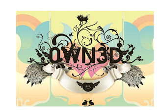
This image was made in Englan by gentelmen, The internation illustrated is an online magazine created by two brazillin designers Julio and Victor to eroke and inspine a different sence around designing and illustrating. i do like this image as i think it is really interesting the way thet have made the type look interseting by including it in the pattern and making it look like an image or almost a pattern in its self.
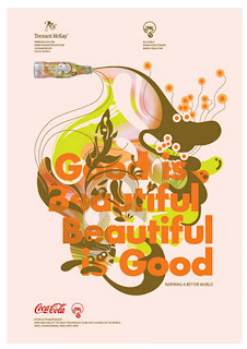
Here is another one of the designers from magnifisent 5, Trinity McKay I do like this as the pattern covers the hole of the page but also has type mixed in with the pattern alomst making the type become an image which i was mmparis designs look like.
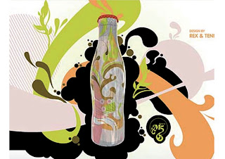
I looked at the rest of the magnifisent 5 designs. the magnifisent 5 are designer who designed the differnt coke bottles Rex and Trie whee 2 of the designers working on one of the designs. I really liked the poster that they designed as it is a little different to the rest as the pttern is not coming out of the bottle it is around it covering the page and the design is also on the bottle in a lighter shade making it stand out I think this is what makes it work well.
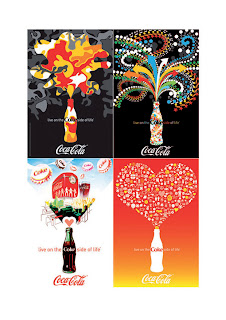
The next website that I looked at was Designers republic as I now they also designed the coca cola bottles and i wanted to see if therers were any different.Designer Republic as designs verius things starting with the Gatecrasher poster and CDs. they also designed issy miyake, MTV, Nickalodeon logos, Orange adverisment company, the coka cola company and many more. I think the Designer repubilc coka cola designs are a little simaler to the rest of them. I do really like them all as they use differnt colours and differnt patterns on each poster but had the same layouts but in all different styles.
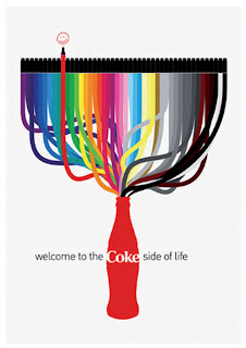
First of all I looked at the non format website, which is a graphic design company based in london that has built a formidable international. The monograph non format presents the full spectrum of thier work. Non format designs posters, cd covers, magazine covers and spreeds. the design for brands like coke cola, Nike, Norway, Nokia, Orange, Wire magazine and meany more. I perticualy liked the coka cola designs as I think they look very good and they also differnt to other coke advertisments that I have seen. I think they are good because they have a good use of colour and are bold, I also like the use of white as it makes the colors stand out more and makes the page look crisp and fresh.
Friday, 14 December 2007
Flash Booklet
For my last page I used it to give more information on why I done the saracastic mark, I then palce the sarcastic mark on the page also so the viewers could get a clear view of it. I then made this my CD holder for my flash presentaion. i palced another symbol over the top of the one on the page leaveing the top and one side not glued down so the cd fitted in perfect I then put the design on to the CD of the bit the CD was going to cover so it made the CD camafaged so you could hardly see it as it was lined up very well. I think my booklet worked really well as each page was differnt but yet they all linked as I used the same colours thoughout the book which I think makes it look so good. I was also really pleased about my pakaing for the CD as I used the book but not only that I managed to make it look like the page buy dding the desing on to the CD to make it look as if there is no CD on the page .
For pages 12 - 13 I displayed my last font that I used which was Book Antiqua, first i wrote out the name and made it that big you could not read what it means, but I did like the composition and the shape it made so I just wrote the name clearly next to it and displayed the sarcastic mark also, I think it looks really good even though it is a little plain.
For the brush script font I first of all had it vertical but the page looed to empty to I then made it horzontal and copied the word several times and over laped them but not have them line up so the page looks really interesting but not to busy you can also see the sarcastic mark which does stand out.
For the Times new Roman font i just made the type an out line and copied it then placed it over the top but slightly of line so it has boubled making the page look that more busyer and it doesnt look that over crowded because thay are an out line, the sarcastic mark also stand out as you can see though the font making it noticable.
The 5th and 6th page is all about the sarcastic mark in the font Comic Sans i have palce the letters and symbols includeding the sarcastic mark overlapping one another as this is what the comic sans clip does in my flash animation si I have done this to make them relate. I think it works as you can still see the sarcastic mark even though they are over lapped and there is alot of white sapce but it has a good ballance but it also makes the type stand out more.
For the 3rd and 4th page I dedicated it to the font Arial to show how the sarcastic mark look in this font I also showed how thw letters and other symbols look, I made the sarcastic mark the main view as this is what the book is about I then put the letters and other symbols ook as if it is coming out of the sarcastic symbol to make it look more interesting.
For page 2-3 I just used these pages for information about what the word sarcasict means. I made this page look more attractive but adding the word sarcatric and the sarcatic mark to it but making it look more interesting, buy repeting it but making them the colour grey the page looks really good, as it is full but not to busy I think the spacing in between the informatin and the design works really well they are not to close together.
I have ceated a booklet based on the fonts I used in my Flash presentation, I wanted to play around with the fonts making them look more interesting and a little like an image. For my front cover I wanted it to stand out so I decided to make it a bold colour with a little information on it so I done it red and put the title of the book in balck placeing a part of a large letter over the top which is part of the wor. I got this from a clip in my animation. For my back cover I choose for it to just be red so it would carrie on from the front i wanted it to be plain so you waould pay more attenton to the rest of the booklet.
Thursday, 13 December 2007
Ish and Sarcastic Marks
Here is another font which I used to do my maek in it is Book Antiqua, which I think has worked really well as it has no cut of lines, as I was going to use Baskerville but when changing it, it had cut off lines so I changed to this font which I think has worked really well. The font which I think the Sarcstic mark works best in is the font Arial, as it is bold, stand out, in graet proportion and almost looks like an image. I think it works really well.
This is the sarcastic mark in the font Brush Scrit which I think looks really good becuase of the way it folows and the shape created.
This is the sarcastic mark in the font Comic Sans.
Here is how the sarcastic mark looks with the font Times New Roman.
This is my sarcastic mark in the font Arial and how it looks next to the alphabet in upper and lower case, numbers and also the other symbols.
Here is how the sarcastic mark will look with a word.
This is my sarcastic mark which I created I took the question mark and split it and then rotated the toop half, I think this works as it looks a little like an S.
This is how the ish mark will look with a word or even numbers.
This is my ish mark that I have created I think it works reall well, to create it I took two symbols that alredy exsisted and put them to getter, the reason for this design is it goes up and down and that what is means. for example £10 ish they dont no the reall price it could go up or it could go down.
Symbols
I was asked to find symbols that would match some words the words were Do, Dont, Active, Passive, Here, There, Us, Them, Trustworthy and Untrustworthy. you could have any symbol possible. So I choose for Do a recycle symbol which mean do recycle. For Dont I choose a no somking sign so dont smoke. For Here I done an animal sign to say animals here and for there I had a arrow poining as in over there. for us and them I had a sign with a couple on and a sign with more them two people on as in them. For active I used a digging sign as he is active, for passive I had a sign of a man weeing as he is passive. for trustworthy I had a first aid sign because you trust them people, for untrustworthy I had a swarzt symbols as in Hitler was untrustworthy.
I had to make up signs or symbols for the following things,
Ennuie (boardom) I done a clock as a sign for boardom as I find when I am board the time comes to a stand still.
Drug users
I had to make a symbol for chicane ahead a modern day hazard. so I decided to make a symbol for people walking alog the street to warn them that there is gangs usually around and also drug users I choose to do the two as this is a big problem in liverpool.
Gangs
Here I had to make a word or phrase mean something completely different by placing it in another place. I then took a one way sign and placed it out side a grave yard as is there is only one way to go (dead). I then took a dead end sign and placed it outside the grave yard I think they work as they made people laugh.
I also made my own dead end sign which looks really good and also makes people laugh.
The last symbol I done was making my self represent something other than myself. so I decided to represent dancing so I took a photo of my self dancing as I would like to become the symbol of dance.
Celebrities monolouges
First of all I didnt change the Gordon Brown monolouge as I think it works really well because if the layout and the size of the font. I did change the Peaches Geldof monolouge as I dont think it represented her that well, it was about fashion even though she is a fashion icon the colours and the layout were very plain and subtle, I redesigned her monolouge as a poster for her band I made the poster loud and messy, which I think represents her very well. I like the way the type is set out in differet positions and not just in a straight line it makes it look more interesting.
I have changed my Amy Winehouse monolouge as I think it was a little to plain and neat to represent her. so I changed it to be messy and loud I copied the monolouge over and over agian pasteing them in different positions and also made them in different fonts. I think it looks really good as it is very busy and stands out but most important it does reprsent the person.
I then changed my Brangalina monologe as I had done my first one on two separet pieces of paper but the same design. but I thought I would of been better with two diffferent fonts, for example a crisp strong one for brad and a feminine curvy one for Angalina so I just put the to fonts together Brads on one line then Angalinas then Brad again and so on, I palced the monolouge in the to right hand corner with alot of space around it which I think looks really good and doesnt look to over crowded.
Hamlet modern changes
The reason for me changing my Hamlet Monolouge was it was a liltte hard to read and looked a little cheesy, I have made the type more simple and moved it over to the bottom right hand side of the page, I also added a touch of colour which I think makes it look that little more interesting and also makes it stand out as it is a very strong colour.
Making Changes to Hamlet monolouges
I have made changes to my Hamlet monolouges as i think the classical one just looked to plain and a little boaring, the modern one was just a little bit to cheesy, so I have made them look a little more interesting. for my modern one I just changed the layout, I have also made the type line up to one another. I do think this lookes better as it looks that little more intersting the way it sits over to one side of the page.
Subscribe to:
Posts (Atom)